In order to answer the third question for my evaluation - (How did you use new media technologies in the construction and research, planning and evaluation stages?) - I have created a commentary where I have spoken about the media technologies I used and add images to illustrate them.
Thursday, 24 November 2011
Tuesday, 22 November 2011
Evaluation Question 3
In order to answer the third question for my evaluation - (What have you learned from your audience feedback?) - I created a wordle document to present my feedback and xtranormal videos to explain my feedback as I felt they added colour to my work and made it look more interesting and creative.
Below is the feedback for my video only
I sent an email with a link to my video to a selection of my peers asking for feedback. here are the screen shots of their opinions:

Below is feedback for my ancillary tasks only.
In order to gain feedback for my ancillary tasks, I sent an email (shown below) to some of my peers hoping to obtain some feedback on my work.

As it can be difficult to hear what the character is saying above, I have pasted the script below:
"Hello. Today I'll be explaining the feedback given for Emily's ancillary tasks. Firstly, she sent copies of her digipaak and magazine advert to her peers via an email.After recieving mulitple replies expressing different likes, dislikes, similarlities and differences between the two pieces she was given an idea of what she did well in her piece and where there was room for possible improvement.
Following this, the main simiarlity she found were certain themes such as the simplicity of the text, darkness of lighting and colour and the taxi image printed on both pieces. This continuity allowed the pieces to be linked together and become recognisable by their audience. Through creating a brand image the band can gain their own look and become individual thus presenting themselves in a new and authentic, vintage way.
Similarly to Emily's music video, the audience feedback also suggested the art within the two ancillary tasks was similar to other artists with the same genre of music already in the market and in the charts.
Overall, these pieces demonstrated simplicity, but mystery and darkness through it's use of bold text and imagery. Emily has said there are little improvements she could make to the magazine advert and possibly more detail could have been added to the digipak provided she was given more time."
Wednesday, 16 November 2011
Evaluation Question 2
In order to answer the second question for my evaluation - (How effective is the combination of your main product and ancillary texts?) - I created a powerpoint presentation as I felt it allowed my work to look more creative and interesting, also differing from my answer to question 1.
Evaluation q 2
Evaluation q 2
Tuesday, 15 November 2011
Evaluation Question 1
In order to answer the first question for my evaluation - (1. In what ways does your media product use, develop or challenge forms and conventions of real media products?) - I created a prezi as I felt it allowed my work to look more creative and interesting.
Thursday, 10 November 2011
Music Video Final Edit
Here is my final edit of the music video to "Icarus - Death & Taxis"
Although the video comes up as a standard size in Youtube, when I put them embedded code into Blogger the shape of the video changed. I have tried to help this but have been unsuccessful as I would rather the settings don't change in Youtube.
Although the video comes up as a standard size in Youtube, when I put them embedded code into Blogger the shape of the video changed. I have tried to help this but have been unsuccessful as I would rather the settings don't change in Youtube.
Music Video Second Edit
I decided to add improvements to my video and finished it before the deadline with time to spare, so here is my second edit. I am looking to show others this copy and hope to have even more feedback to add more improvements in time for my final edit.
Wednesday, 9 November 2011
Ancillary Task - Digipak Final

This is the front cover for the final edit of my digipak. I decided to use a simple photograph I took myself of the lead singer playing the guitar. This image suggests simplicity and shows the audience the artist and his talents. I photoshopped this image to make it appear more aesthetically pleasing and made the colours more dull, as I felt this made the image moody and mysterious which would make it more appealing to it's audience. I used a simple font for the text and felt having it in black would allow it to look subtle but slightly stand out. I also decided to have the font reasonably small to allow all of the focus on the artist. The title of this album is also named Death & Taxis so I decided to just have one piece of text on the front cover which spoke for the title and name of the band. (- also known as an eponymous debut album)

The two images above would be pages 1 and 2 (refer to draft images to show where they would be placed.) When the front cover is opened on the digipak, these two images will be spread across the inside. I also took this image myself and split it in half in order to have it stretched across two pages which I felt looked really effective. I have changed this images colour to 'sepia' which allowed it to look more moody and subtle. This image also ties in with the theme of the band name as it's a dead street filled with only taxis.


This is the back cover of the digipak. I wanted the names of the songs to stand out the most so felt there was no need for any artwork on the background. I used a simple text to tie in with the simplistic theme and made the white shade slightly grey to look moody and blend better with the black background. I also put the logo of the record company on the bottom left hand corner and a barcode on the right. This creates authenticity and I feel makes the cover look better and more realistic.

Ancillary Task and Video Feedback
In order to gain an idea of what needed to be improved on my draft ancillary tasks and music video, my teacher sent emails with feedback.
Feeback for draft music video:
The ice cube melting works well but is too far away; I suggest a re-shoot in CU/XCU from the side, level with the cube & insert it sporadically into the video. You could also use a candle & melting wax (ref. the title), perhaps feathers floating about?
Not really sure about the external shots in the countryside, everything looks nice & is shot proficiently, but I just don’t get it.
There is a confusing discontinuity between the shots of you both singing (together & alone); sometimes the mics are there, sometimes not, you are on the star’s left (screen right), then when he is singing he has a brick wall next to him
Only one shot (too long) of the star playing the keyboard in what is an electronic track – can you make any more of the instrument(s)?
Overall this first draft lacks the pace & dynamism that it should have, which could be rectified by editing & some re-shooting, perhaps using more inserts?
Work-in-progress = Level 2, 23/D
Feeback for draft music video:
Well done for meeting the deadline early & for working so hard & single-mindedly on this.
You have some nice ‘arty’ shots & some good ideas in this video & there are some good performances from your star performer.To improve: in general all of the takes are too long.
The tree silhouette shots are nice as are the silhouette shot of you & the star but they are too long.The ice cube melting works well but is too far away; I suggest a re-shoot in CU/XCU from the side, level with the cube & insert it sporadically into the video. You could also use a candle & melting wax (ref. the title), perhaps feathers floating about?
Not really sure about the external shots in the countryside, everything looks nice & is shot proficiently, but I just don’t get it.
There is a confusing discontinuity between the shots of you both singing (together & alone); sometimes the mics are there, sometimes not, you are on the star’s left (screen right), then when he is singing he has a brick wall next to him
Only one shot (too long) of the star playing the keyboard in what is an electronic track – can you make any more of the instrument(s)?
Overall this first draft lacks the pace & dynamism that it should have, which could be rectified by editing & some re-shooting, perhaps using more inserts?
Work-in-progress = Level 2, 23/D
After taking these comments into consideration I have planned to take new shots and edit most of the video in order to make it better.
Feedback for ancillary tasks:
Digipak individual panels must be uploaded, so cannot see the detail to grade;
Advert works well, strong, stylish image, good font & conventions applied (itunes logo?), should the bottom black band be smaller? 8
Similarly, I have taken this feedback into consideration and have planned to make changes and improvements to my ancillary tasks.
The Filming & Editing Process

This is a print screen of the editing software Premier Pro including my project, I took this print screen as I was adding final improvements to my work which is why the entire video can be seen in the timeline. I faced no issues while editing and had the ability to complete my work before the deadline and to a standard I believe is good.

Above is a photograph of me filming the location for the shots taking place in the live studio, where the singer is lip-syncing.
Friday, 14 October 2011
Permission Letter (to use track)
Here is a copy of the letter I recieved in order to gain the permission to use the track "Icarus" by the band "Death & Taxis" written and produced by my father Ian Clarke.


Digipak Draft

Front cover, this image will be in colour on the final piece. This is an image of the lead singer and the name of the band is printed clearly in large black letters.

This is images of lined up taxis stretched over two pages, on my final piece this image will be in sepia.

I plan to have a CD over the background on the middle panel and a DVD on the right panel.

This is the back cover, I think I'm going to have either a blank image of a brick wall or a guitar placed on a stand to one side. Here will also include a list of all the tracks, a bar code and some logos.
Magazine Advert Draft

layout - I feel I've used a simple layout design on this piece, putting emphasis on the album's title and the image. I have put all of the text central as I feel it makes the piece look more aesthetically pleasing and more attractive. The text is made large and bold to stand out on the page but also looks simplistic.
images - The image on this piece I took myself, it's location is a small town center near where I live. I felt this angle for the line of taxis was the most effective and I have used sepia as it's moody and creates some colour. Although I have fiddled with the lighting on this piece slightly, it was taken as the sun was setting which also adds to the mystery and depth of the image.
fonts - I have used large, bold text in order for it to stand out, it's also in white to project off the black background. The title is the largest text as I feel it's the most important section for the audience to read. The logo's are the only text in colour, which means they suggest individuality and seperation.
colours - I have used a black background because I felt it contrasted best against the sepia image, I have also used white text over the background as it was the most appropriate and best looking in order to stand out.
Digipak Analysis
 THE STROKES
This is "The Strokes" front cover of their digipak. It's a very plain cover and shows an artistic flare with the interesting black/white colour scheme with a dash of orange. The cover also contains an advisory note to allow their audience to be aware of its contents. The name of the band is written in the bottom left corner which isn't very clear.
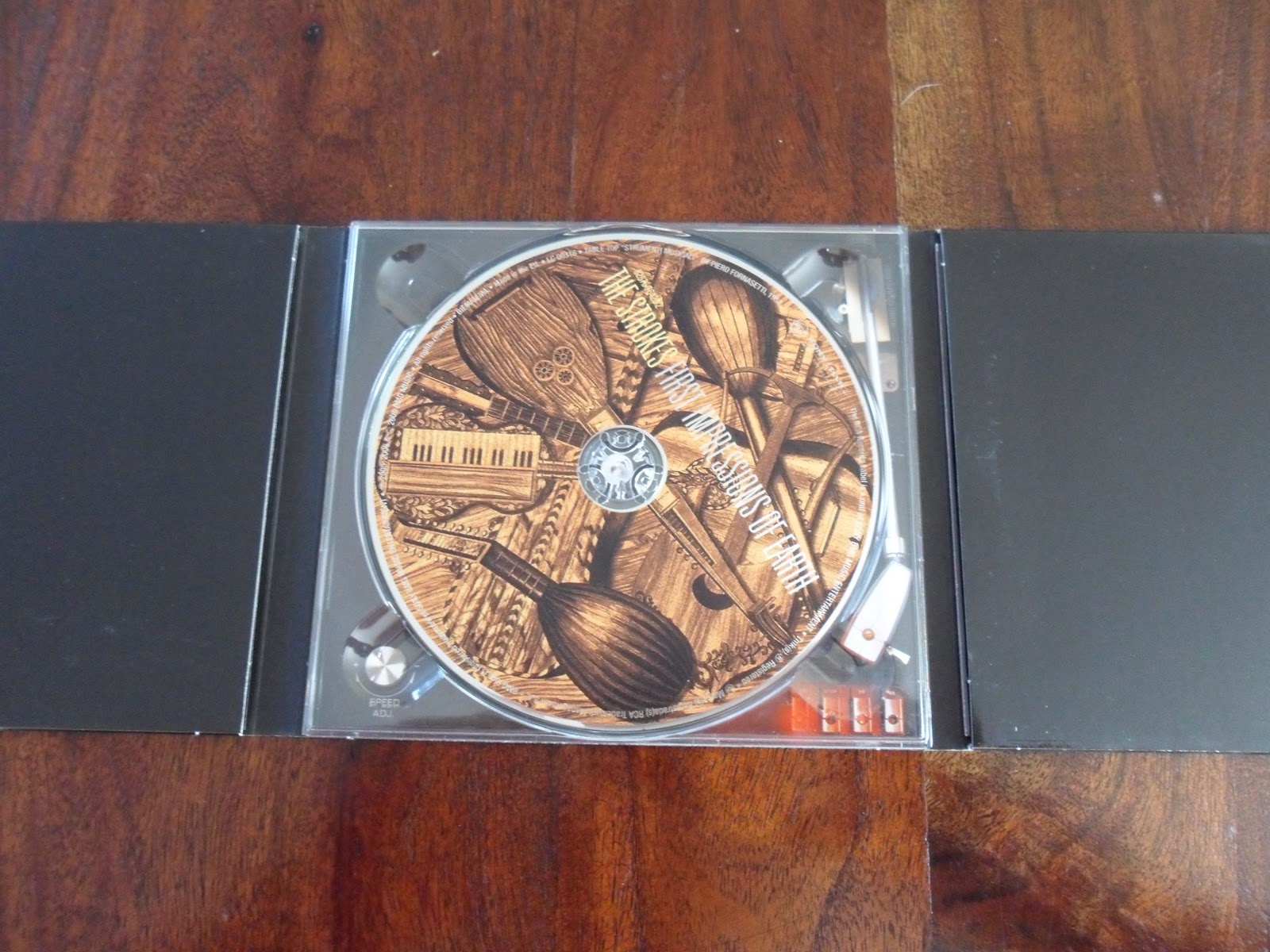
This is an image of the digipak fully open. In the middle is their album which contains images of different styles of guitars in sepia. This image is mysterious and complicated and it likely to draw the attention of their audience. However, on the right and left panels they are in plain black containing no images or text. Within the left panel pulls out images of the band members and their names. Within the right panel pulls out a booklet with various images and names of their songs along with thank yous and details about it's creation.

RADIOHEAD

This is the digipak for the band "Radiohead" who's music I feel is fairly similarly to that of "Death & Taxis". The artwork on this album is really bizarre and individual, using mainly browns and blacks. The covers on this digipak are meant to look worn and old, which gives it a scruffy but mysterious feel - which would appeal to their target audience. The writing on this piece also looks hand written, which is mysterious and slightly scruffy, tieing in with the overall theme.
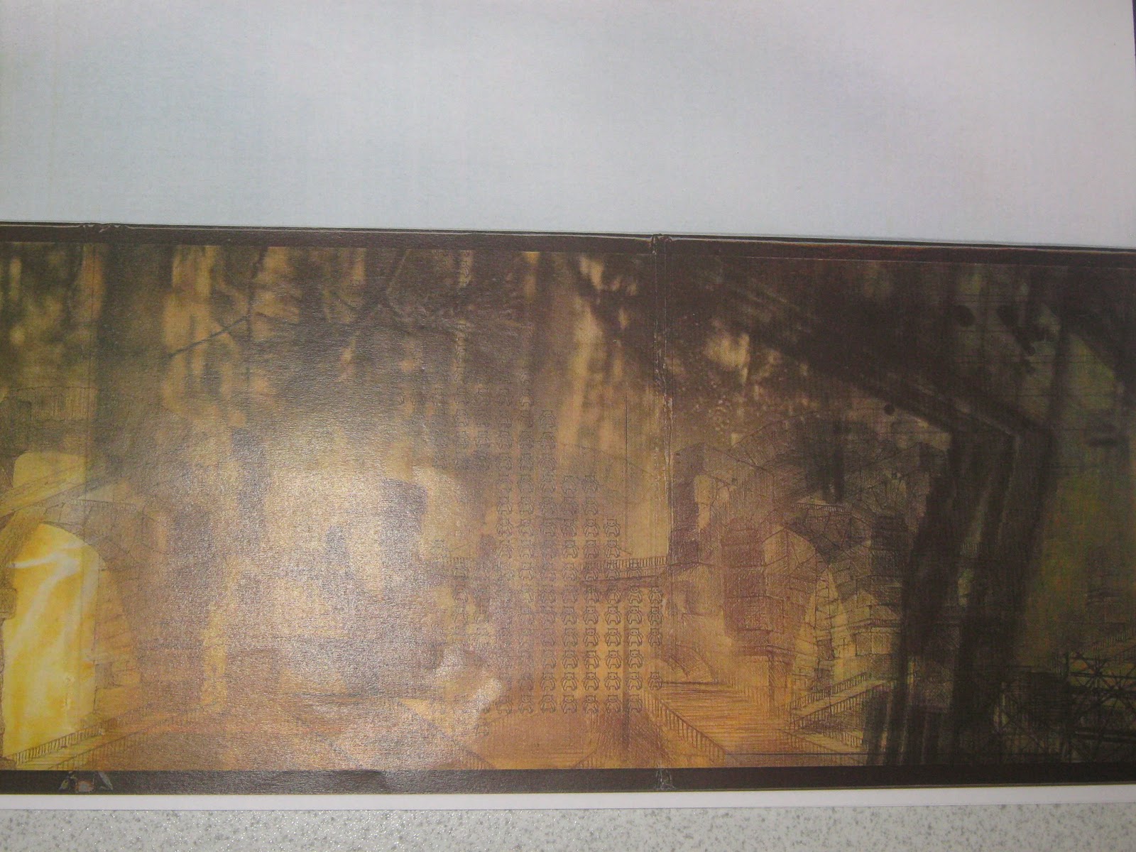
This image is very mysterious and it's really difficult to make out what the entire page is made up of. Again, I believe this image has been made to look old and worn in order to fit in with the theme. This piece catches the eye because it has a few intricate details that draw the audience in, in order to reveal what the image is made up of.
Thursday, 13 October 2011
Magazine Advert Analysis

costume - the band members costume here looks fairly laid back and "indie". I think their target audience would dress similarly to this and therefore relate to their style.
body language - the band all have open laid back postures which would appeal to their audience as they look as though they're just relaxing and having a good time.
colour - this advert uses bright colours that give a warm feeling, this could have relation to the theme of their music as it could suggest their music is chilled out.
facial expression - the band members appear to all have fairly subdued facial expressions, although none of them are looking into the camera this gives the audience the impression that they are relaxing and acting as though they are unaware of the camera.
shot type - this is a long shot of the three men sat down in the foreground of a beach with palm trees and the stretch of the beach behind them. This makes the image interesting and nice to look at.
font - the font is large, white and very simple. They would have used a large font to make the text stand out and present the audience with a clear indication of their name. I think they would have used white text as it contrasts well with the background and the fonts simplicity could also be a reflection upon the style of their music.
layout - the layout of this piece also demonstrates simplicity as their are no complicated mixed images or fonts, everything is set out nicely and clearly.

colour - this advert has used bold, bright colours that allow it to stand out and appeal to their audience who are likely to be young and into dance music.
shot type - the image on this advert consists of a close up of a monkey eating a plant. This produces vibrant colour but creates a mysterious and interesting feel to the ad, furthermore it creates a humorous sense to the piece. This makes the ad more attractive and appealing to its audience.
font - the font on this piece is extremely bold and a strange shape, this makes it really stand out on the page making it more appealing and clear to its audience.
layout - the layout on this piece is clearly structured to allow each component to stand out on its own. I think the layout of this piece is really appealing to its audience because it's clear but filled with interesting colours and bold patterns.

costume - the character standing up is wearing a smart casual combination of a shirt and trousers. This suggests simplicity and may give a reflection upon their style of music. However, the other men in the video are wearing black mysterious clothing which adds a darker side to the piece. The bands audience are probably likely to wear similar clothing which they can relate to which makes this image more appealing.
body language - the stood up male has his hands in his pockets which suggests he is laid back and posing casually. The other band members are all sat and looking away from the camera which also makes them look laid back. The males on the right and left look thoughtful while the male in the center sat down is looking into the camera thoughtfully.
colour - the colour in this image is quite dull, using mainly blues and browns which are neutral but cold colours. The combination of the two mixed images on this piece blend into each other which mean there is no focus on a specific part of the image.
facial expression - as previously mentioned, all of the band members look thoughtful and are looking away from the camera. This could suggest they are portraying intelligence and maturity which would appeal to their audience.
shot type - this piece is a mixture of a shot of the four men in a room and the other image is of a busy street. The blend of these two images creates an interesting but complicated piece of artwork to look at.
font - the name of the band "Noah & The Whale" is in very large bold text which allows it to stand out and project off the page in order to be clear for the audience to view. Below this the font changes to look more elegant to say "last night on earth" which would be the name of their album. I believe this is done so the font can be easily recognised on the page in order to the audience to be made aware of its name. At the bottom of the page is a rating from a magazine which is in a standard small font, as this is less important. The date of the album is also made larger in order to stand out and become clear to its audience.
Tuesday, 27 September 2011
Shooting Schedule & Camera Angle Planning
Shooting Schedule
As most of our shots are on locations that are not close to home, we must wait untill the weekend in order to travel and spend an entire day shooting.
Friday 30th September - all day shooting road shots
Saturday 1st October - all day shooting field shots
Sunday 2nd October - all day shooting indoor/misc shots
Camera Angle Planning
I plan to have multiple different shots from various angles of the singer performing live in a studio, which means I can have a different shot for each line of the song but in the same location. I feel this will create continuity and allow the piece to look interesting.
Similarly, I plan to have different shots from various angles outdoors (in the field and the country road) as the band member plays his guitar and often when performing some vocals. This creates narrative in the piece and some continuity as I do not want the visuals to become too complicated but some differentiation will make the video interesting.
Monday, 19 September 2011
Storyboard

The opening shot will be of a sunset, and the title of the track and band will slowly fade in.

Following this will be a sped up clip of an ice cube melting on a table, this is to represent the breakdown of the current climate change.


This is a long shot of my father holding his guitar looking toward the camera. I am yet to decide whether he would be static or slowly walking forward.


Tracking left, following the singer walking through a field.

Tracking left, close up of the singer's face as he walks through the field.

Tracking left, close up of the singer's guitar as he walks through the field.


BV's mid shot of the male vocalist lip syncing.


Female singer first introduced, singing BV's into the camera stood in front of the brick wall.

Male singer stood in a studio lip syncing into a microphone.

Both singers stood sideways against the brick wall, the female slightly closer to the camera. Both lip syncing.


Close up of the male singer playing his guitar.


Long shot of the male singer playing his guitar in the middle of a field.

Very slowly tracking left up toward the sun.

Male character stood with his back to the camera looking up toward the sun, slowly raising his hand to cover the light.


Empty shot of the road.

Empty shot of the field.

Male character notices paper at the front door and bends down to pick it up.

He slowly opens the paper but the camera cannot see what is written on it.

The paper is lay out on the table to reveal the words "Sieze the day"
Subscribe to:
Comments (Atom)