 THE STROKES
This is "The Strokes" front cover of their digipak. It's a very plain cover and shows an artistic flare with the interesting black/white colour scheme with a dash of orange. The cover also contains an advisory note to allow their audience to be aware of its contents. The name of the band is written in the bottom left corner which isn't very clear.
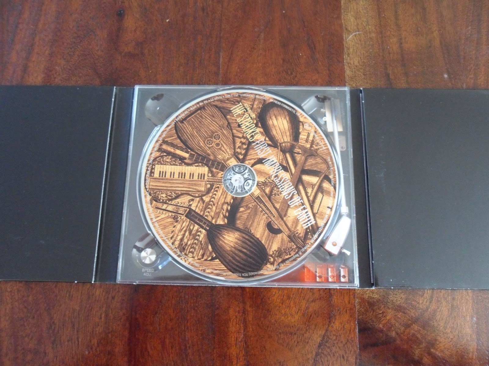
This is an image of the digipak fully open. In the middle is their album which contains images of different styles of guitars in sepia. This image is mysterious and complicated and it likely to draw the attention of their audience. However, on the right and left panels they are in plain black containing no images or text. Within the left panel pulls out images of the band members and their names. Within the right panel pulls out a booklet with various images and names of their songs along with thank yous and details about it's creation.

RADIOHEAD

This is the digipak for the band "Radiohead" who's music I feel is fairly similarly to that of "Death & Taxis". The artwork on this album is really bizarre and individual, using mainly browns and blacks. The covers on this digipak are meant to look worn and old, which gives it a scruffy but mysterious feel - which would appeal to their target audience. The writing on this piece also looks hand written, which is mysterious and slightly scruffy, tieing in with the overall theme.
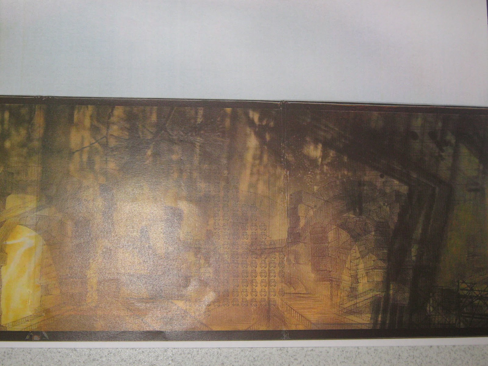
This image is very mysterious and it's really difficult to make out what the entire page is made up of. Again, I believe this image has been made to look old and worn in order to fit in with the theme. This piece catches the eye because it has a few intricate details that draw the audience in, in order to reveal what the image is made up of.
No comments:
Post a Comment