In order to answer the third question for my evaluation - (How did you use new media technologies in the construction and research, planning and evaluation stages?) - I have created a commentary where I have spoken about the media technologies I used and add images to illustrate them.
Thursday, 24 November 2011
Tuesday, 22 November 2011
Evaluation Question 3
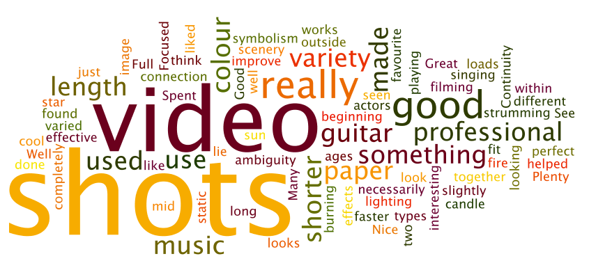
In order to answer the third question for my evaluation - (What have you learned from your audience feedback?) - I created a wordle document to present my feedback and xtranormal videos to explain my feedback as I felt they added colour to my work and made it look more interesting and creative.
Below is the feedback for my video only
I sent an email with a link to my video to a selection of my peers asking for feedback. here are the screen shots of their opinions:

Below is feedback for my ancillary tasks only.
In order to gain feedback for my ancillary tasks, I sent an email (shown below) to some of my peers hoping to obtain some feedback on my work.

As it can be difficult to hear what the character is saying above, I have pasted the script below:
"Hello. Today I'll be explaining the feedback given for Emily's ancillary tasks. Firstly, she sent copies of her digipaak and magazine advert to her peers via an email.After recieving mulitple replies expressing different likes, dislikes, similarlities and differences between the two pieces she was given an idea of what she did well in her piece and where there was room for possible improvement.
Following this, the main simiarlity she found were certain themes such as the simplicity of the text, darkness of lighting and colour and the taxi image printed on both pieces. This continuity allowed the pieces to be linked together and become recognisable by their audience. Through creating a brand image the band can gain their own look and become individual thus presenting themselves in a new and authentic, vintage way.
Similarly to Emily's music video, the audience feedback also suggested the art within the two ancillary tasks was similar to other artists with the same genre of music already in the market and in the charts.
Overall, these pieces demonstrated simplicity, but mystery and darkness through it's use of bold text and imagery. Emily has said there are little improvements she could make to the magazine advert and possibly more detail could have been added to the digipak provided she was given more time."
Wednesday, 16 November 2011
Evaluation Question 2
In order to answer the second question for my evaluation - (How effective is the combination of your main product and ancillary texts?) - I created a powerpoint presentation as I felt it allowed my work to look more creative and interesting, also differing from my answer to question 1.
Evaluation q 2
Evaluation q 2
Tuesday, 15 November 2011
Evaluation Question 1
In order to answer the first question for my evaluation - (1. In what ways does your media product use, develop or challenge forms and conventions of real media products?) - I created a prezi as I felt it allowed my work to look more creative and interesting.
Thursday, 10 November 2011
Music Video Final Edit
Here is my final edit of the music video to "Icarus - Death & Taxis"
Although the video comes up as a standard size in Youtube, when I put them embedded code into Blogger the shape of the video changed. I have tried to help this but have been unsuccessful as I would rather the settings don't change in Youtube.
Although the video comes up as a standard size in Youtube, when I put them embedded code into Blogger the shape of the video changed. I have tried to help this but have been unsuccessful as I would rather the settings don't change in Youtube.
Music Video Second Edit
I decided to add improvements to my video and finished it before the deadline with time to spare, so here is my second edit. I am looking to show others this copy and hope to have even more feedback to add more improvements in time for my final edit.
Wednesday, 9 November 2011
Ancillary Task - Digipak Final

This is the front cover for the final edit of my digipak. I decided to use a simple photograph I took myself of the lead singer playing the guitar. This image suggests simplicity and shows the audience the artist and his talents. I photoshopped this image to make it appear more aesthetically pleasing and made the colours more dull, as I felt this made the image moody and mysterious which would make it more appealing to it's audience. I used a simple font for the text and felt having it in black would allow it to look subtle but slightly stand out. I also decided to have the font reasonably small to allow all of the focus on the artist. The title of this album is also named Death & Taxis so I decided to just have one piece of text on the front cover which spoke for the title and name of the band. (- also known as an eponymous debut album)
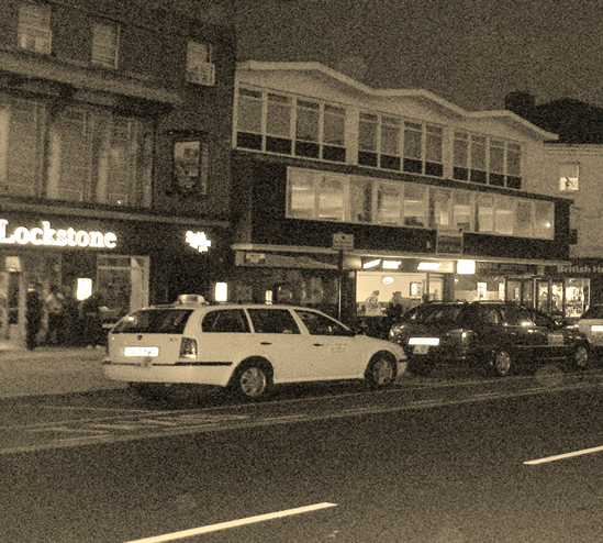

The two images above would be pages 1 and 2 (refer to draft images to show where they would be placed.) When the front cover is opened on the digipak, these two images will be spread across the inside. I also took this image myself and split it in half in order to have it stretched across two pages which I felt looked really effective. I have changed this images colour to 'sepia' which allowed it to look more moody and subtle. This image also ties in with the theme of the band name as it's a dead street filled with only taxis.


This is the back cover of the digipak. I wanted the names of the songs to stand out the most so felt there was no need for any artwork on the background. I used a simple text to tie in with the simplistic theme and made the white shade slightly grey to look moody and blend better with the black background. I also put the logo of the record company on the bottom left hand corner and a barcode on the right. This creates authenticity and I feel makes the cover look better and more realistic.
Subscribe to:
Posts (Atom)